No surprise, most digital users search through Google via their mobile device. There has been a universal rise in person on person collisions as people walk with their heads buried in their phones.
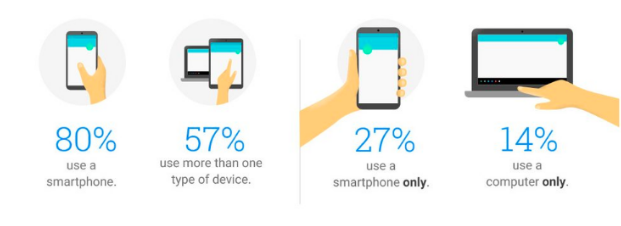
Okay in all seriousness, users are reliant on their mobile devices. The following snapshot of cross-device usage in a single day is testament to this.
Google’s previous ranking algorithm
Previously Google’s ranking systems reviewed the desktop version of your site’s content to evaluate its relevance to users.
Within the past few years, Google found this was causing issues when mobile content was different to that of desktop. Its algorithms were failing to properly analyse the actual page that is viewed by mobile users.
To make the search results your users see more relevant and accurate, Google began experimenting on utilising mobile-first indexing algorithms in 2016. During this
testing there’s been a combination of desktop, app and mobile data used to rank site content within search results.
What’s changing?
Ultimately, Google’s end goal was to rank results primarily based on mobile given the mobile oriented digital landscape we now live in.
Rankings will continue to pull in data from desktop or app content if required, but the primary focus is on mobile. Desktop will be used if it has additional ranking information but there’s no guarantee that it will be crawled.
The focus on mobile simply aims to provide an optimal search experience for users. This has been a transitory process to date but as of September 2020 all sites will be indexed mobile-first. Don’t fret just yet. Google’s already confirmed that most sites are ready for this transition and they’ve actually shifted 70% of sites over to mobile first indexing already (after checking they’re ready).
What does this mean for you and your site?
Your site should* be responsive.
*Needs. It really needs to be responsive. If it isn’t, you’re already behind and come September your site will no longer be optimised for Google’s algorithm.
Content should be consistent and responsive across desktop, tablet and mobile. It should react and respond automatically based on the user’s device (also known as a dynamic serving site for those of you who are technically inclined).
But optimising for mobile usability isn’t the same as optimising for mobile-first indexing.
This is just the tip of the iceberg. If you’re wanting to optimise your site for mobile there’s plenty more you can be doing.
How to check if your site is ready
To ensure your site is optimised for this change:
- Serve structured markup for both desktop and mobile.
- In simple terms – make sure your site is responsive and content consistent across desktop and mobile.
- This included structured data content such as breadcrumbs, URLs, captions, file names or product titles.
- You can test your site by typing the URLs of both versions into the Structured Data Testing Tool and comparing the output.
- Have your developer remove any unnecessary markup that isn’t relevant to the content of each page.
- Verify your mobile version is accessible to Googlebot using the robots.txt testing tool
- Ensure you have verified your mobile site in Google Search Console
What changes should I make?
By ‘I’ we mean your developer or SEO team. Much of these changes require coding changes to your website and higher level technical knowledge.
- Use the same meta robots tags on mobile and desktop. If you use different meta robots tags then tag the mobile site as noindex or nofollow. Your developer or SEO team should be able to assist with this should these terms be unfamiliar.
- Don’t lazy-load primary content. Google will only review content that exists as is (i.e. it doesn’t review content that is dependant on user interaction like swiping, clicking or typing). So ensure that your primary content is available on load.
- Avoid video and image URLs that update on load. As per the previous point, Google crawls the existing content prior to engagement or change.
- Ensure consistency in your content across mobile and desktop. This includes:
- High quality visuals on the both mobile and desktop
- Ensure consistent alt text is used across visual content
- Error status page content is rendering same on mobile as desktop
- Ensure your mobile has an XML or media sitemap with relevant links.
- Ensure Google can crawl your resources and your server is prepared to receive an increase in mobile crawl rates (should your mobile site sit on it’s own separate server).
Executing a mobile transformation
We take a mobile-first approach to our design and development execution through our Digital Partnership program.
As an extension of your business, we collaborate on your broader marketing strategy and advise on and execute your digital goals.
Enquire about a Digital Partnership to get your site ready for mobile-indexing and further mobile optimisations.