There’s a fairly straightforward formula used when it comes to creating online retail stores. We’re talking homepage, PLP, PDP, inner content pages, blog. You know the drill.
These best practice structures are accepted by the online community (customers, business owners and marketers alike) as the expected layout for an eCommerce experience.
It’s how you differentiate yourself from this norm that optimises your online experience and defines your brand. In saying that, we’re not suggesting you drastically rewrite the norm and create a website so unique it’s rendered unusable. We’re talking about improving and optimising the existing functionalities you already have in place.
Not quite sure what we mean? Then keep reading. This article addresses simple functional additions that set your eCommerce apart and boost conversion.
1. ✨NEW✨ Quick Buy
The traditional Quick Buy feature short tracks users directly from your collection page to the checkout. One-click shop! Though not all product ranges are suited for this one-click stop shop.
More like a 3 or 4 click shop after your customer enters the product page; opens the sizing or colour tab; selects their variation; and then goes to the cart.
US street-fashion brand Hat Club and footwear retailer AllBirds condensed this process down to streamline the purchasing flow via an extension on the traditional Quick Buy functionality.
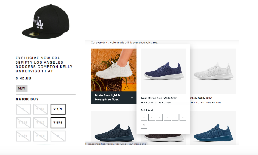
This extension is a seamless expander on the product image that appears on hover via the Collection page. The expander provides additional sizing options, that on selection take you straight to the cart.
This minimises the time to checkout and streamlines the purchase process for your customer. Win-win!
2. ? Upsell and inform (but mainly upsell)
Your copywriters and content marketers work hard to produce valuable content relevant to your brand. It ties into your broader content marketing strategy, which (when we cut down on the fluff) ultimately aims to increase brand awareness and revenue.
Yet for many eCommerce retailers their blog is underutilised and difficult to correlate to direct revenue growth.
OzHairy & Beauty articles include a Featured Products column to streamline product discovery and the checkout process. It contains products that are directly referenced in the article and are of relevance to the user. Multiple products are available as you scroll through the article and feature descriptions, price, reviews, tags & CTA.
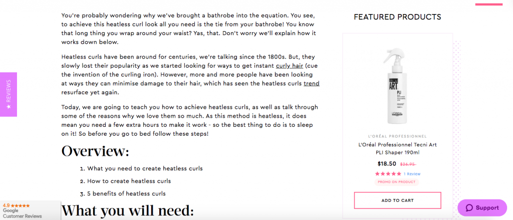
This optimises on your users interests and adds value to the content. Most importantly, it creates a direct sale pathway on products that are personalised to the user.
3. ? Cross-pollination of content
Yes we’re moving into bee and bird terms now. From flower to flower or tree to tree, bees and birds carry nature and cross-pollinate to improve our biodiversity. It’s time we did the same.
Typically marketers think of cross-pollination via social media channels – sharing content across Facebook, Linkedin, Twitter. Yet cross-pollination can work within your website itself to share information and highlight specific value points.
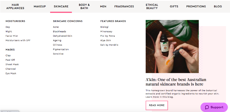
For example OzHair & Beauty feature product imagery and blog links within their mega menu. This creates a more engaging experience when using the menu. Reiteration of these blog articles through the menu further positions OzHair as a reliable knowledge source for beauty advice.
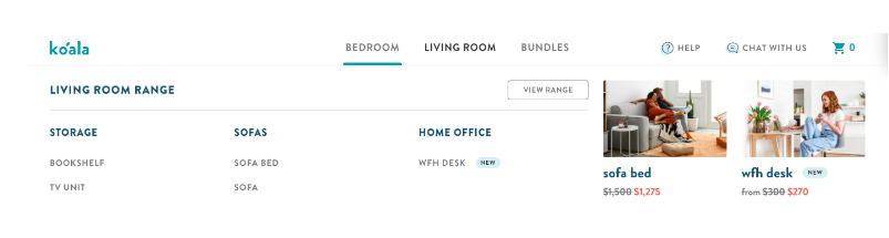
Similarly, Koala maintains their standard mega menu with a sale feature alongside to encourage discounted purchases. This ensures that their primary menu is concise (only 3 x menu items). With each sale item connected to a specific Collection (Bedroom, Living or Bundles) the products are better targeted to users.
4. ? Banner products
Italian tea brand Mokarico cut straight to the point with a product imagery slider within their homepage hero banner. This is a sure fast way to communicate products above the fold and streamline the purchasing process.
This is beneficial for businesses with a small product range or to display featured, promotional products.
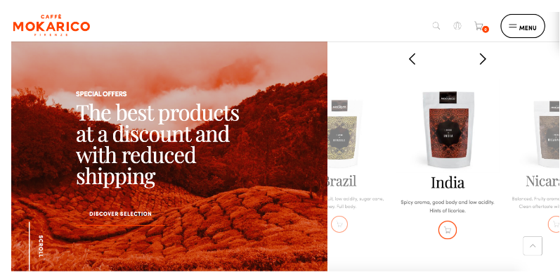
Before jumping into this headstrong approach, it is worthwhile to think about what your customers may need. For example, not all customers are ready to make a purchase as soon as they land on your site. They may require priming and further information on your brand or product before a sale is made. In this case, a product strip further down the homepage may be warranted.
5. ? Product visualisations
We’re tactile beings. Online retail demands visualisations to make or break a sale online. Without seeing the product you’re very unlikely to convert a user.
Therefore adding a new visual dimension to the usual digital user flow will make that add to cart decision oh so much easier.
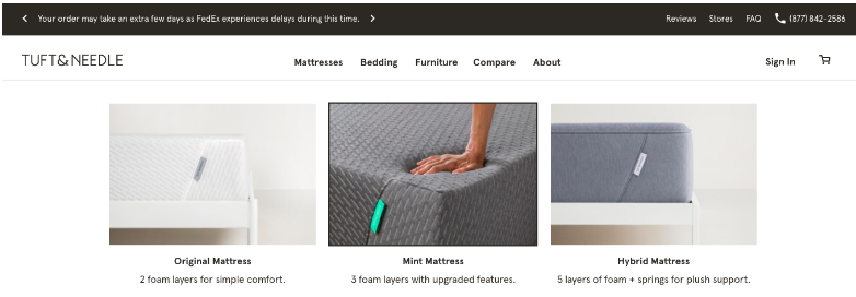
With only a few key products, Tuft & Needle is able to showcase products in detail via the mega menu. The images have a roll over effect so users are presented with multiple angles of the product. These visuals support the users decision making process from their first interaction with the menu.
Bumbleride takes it up a notch further through 3D product animation. This is a new avenue of online retail which isn’t yet utilised by the majorities. The use of 3D imaging saw a 33% increase in conversion rate and time on page up 21%. It bridges the gap between online and instore by providing confidence in the product.
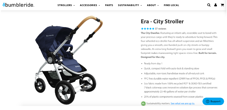
Learn how Bumbleride did it through Shopify without coding or third-party apps.